
GitHub-Style Habit Tracker: Why Visual Streaks Actually Work
Tenor
Tenor Editorial Team
Why Visual Progress Changes Behavior
A habit becomes easier to maintain when you can see it.
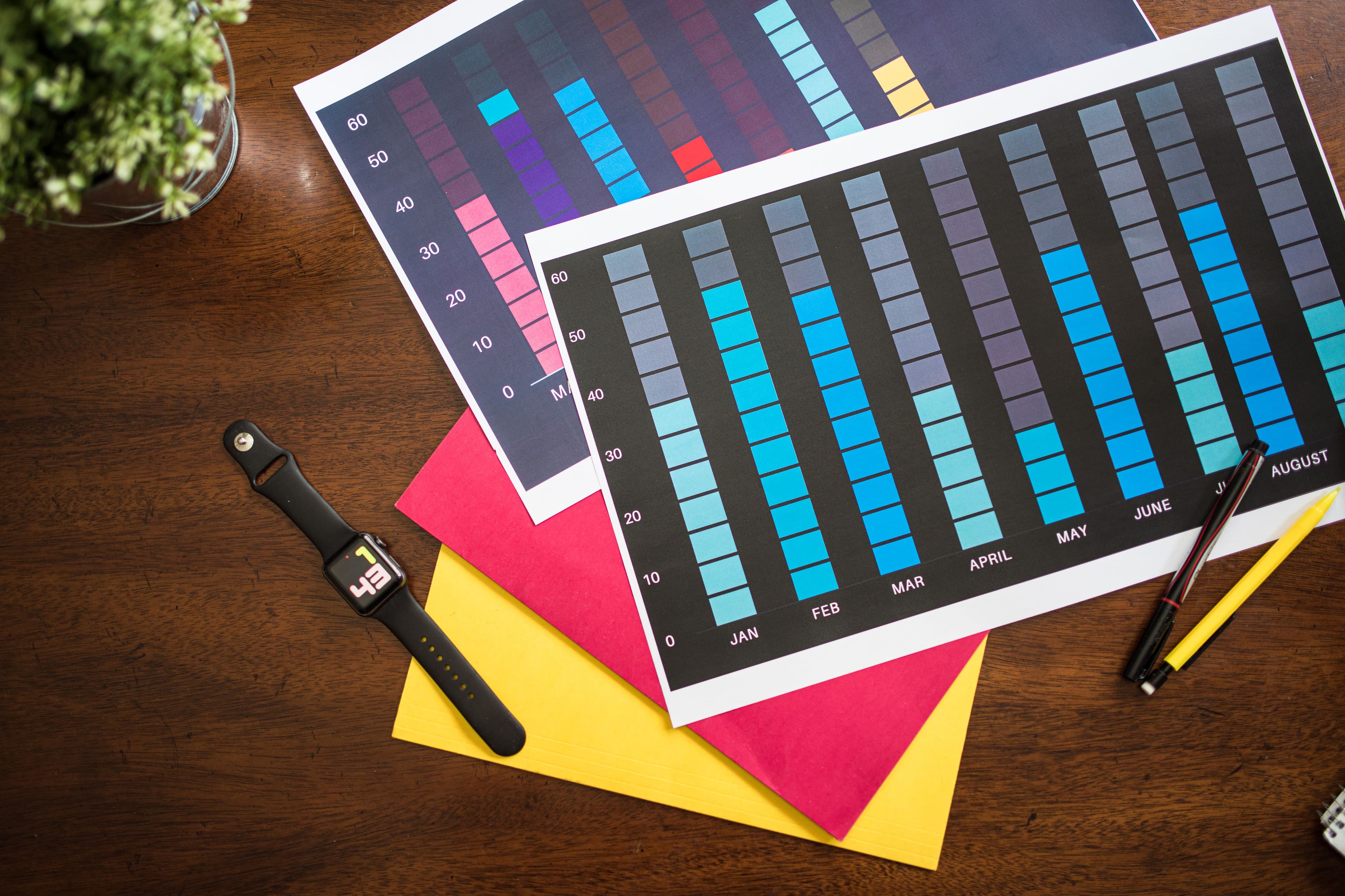
That is why calendars, heatmaps, streaks, and progress charts are so effective. They turn consistency into something concrete. Instead of guessing whether you are improving, you can look at the pattern and know immediately.
This is one of the reasons GitHub-style contribution graphs feel so satisfying. They make progress visible. A habit tracker that uses the same idea can give you the same effect.
Why Streaks Matter
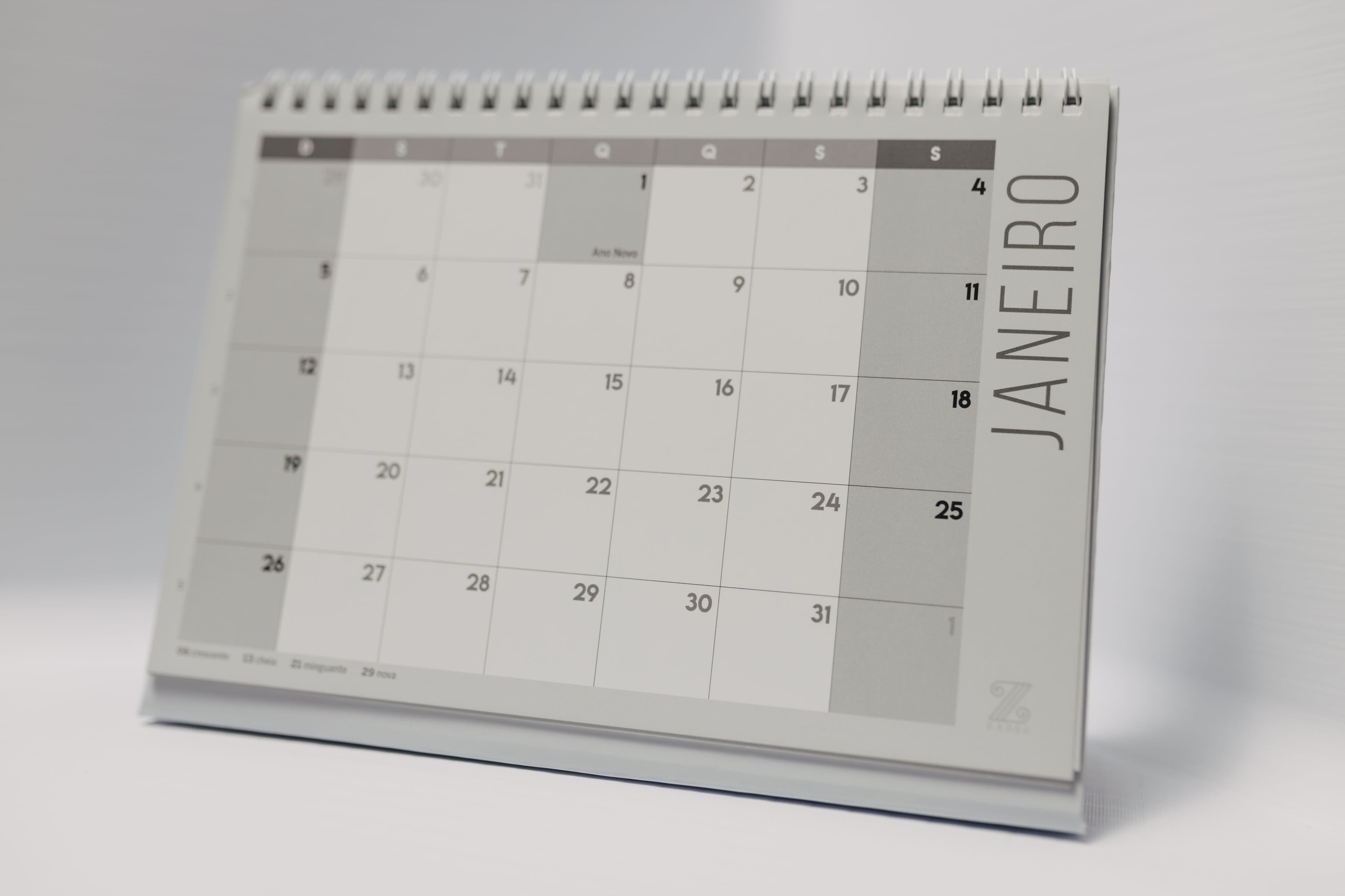
Streaks work because they create a visible chain.
Once a few days are filled in, you do not want to break the pattern. That small psychological push can be enough to keep you going on days when motivation is low.
A good streak view does not just show success. It also shows gaps. That matters because gaps are useful feedback. They show you where your routine is breaking down.
The Best Habit Tracker Charts Are Simple
A chart should answer one question quickly:
Am I staying consistent?
That is why the most effective visual trackers are usually simple. You do not need dozens of metrics. You need a clear view of your habits over time.
Useful chart views include:
- Week view for short-term consistency,
- Month view for medium-term patterns,
- Year view for long-term momentum.
Each one serves a different purpose, but together they show the full story.
Tenor's Year View Makes Progress Obvious
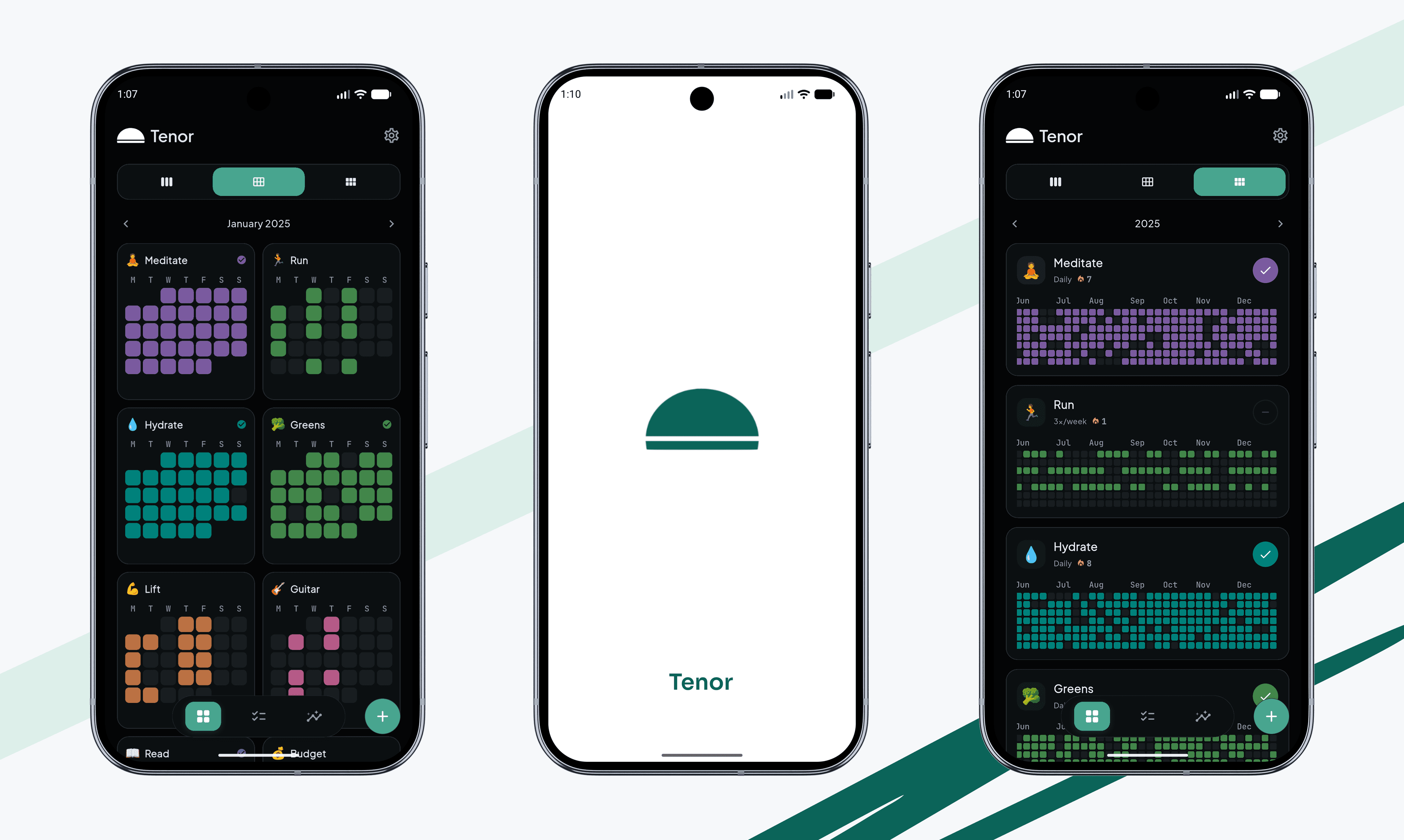
Tenor includes a year-style habit grid inspired by contribution maps.
That means:
- completed days light up,
- skipped days remain dim,
- and the whole year becomes readable in one glance.
This is especially useful for habits that take time to build. A single day does not tell you much. A month starts to reveal patterns. A year shows the truth.
If you want a habit tracker that helps you think long term, a year view is one of the most valuable features you can have.
Statistics Help You Stay Honest
Progress charts are great, but raw numbers matter too.
Tenor's stats help you understand:
- current streak,
- longest streak,
- total completions,
- and completion rate.
Those numbers keep the visual view honest. You can see not just what the year looks like, but how well the habit is actually going.
That combination of visual and numeric feedback is powerful because it gives both intuition and precision.
Why This Works for Developers and Data-Oriented Users
People who like software, systems, and data often respond strongly to contribution maps because they are already familiar with that visual language.
If you already use GitHub, a habit tracker with a similar grid feels intuitive immediately. You already know how to read it. That lowers the learning curve and makes the app feel familiar.
Tenor borrows that clarity for habits, so your routine becomes easier to inspect at a glance.
When Visual Tracking Works Best
Visual tracking is especially useful when:
- you want to build a long-term routine,
- you like seeing progress accumulate,
- or you need a simple way to spot weak spots in your consistency.
It is less useful when the app is cluttered or the visuals are hard to read. The chart should support the behavior, not become the behavior.
Make Your Habits Visible
Visual habit tracking is not about making the app look fancy. It is about making progress hard to ignore.
When you can see your habits, you are more likely to keep them alive. That is the real value of streaks, calendars, and charts.
Try It for a Week
If you are curious whether visual tracking helps, start with one habit and use a calendar-style view for seven days.
You do not need perfect results. You just need something visible enough to keep you engaged.
 and watch your habit grid fill up one day at a time.
FAQ
Why do visual streaks work so well?
They make progress easy to see. When the pattern is visible, you are more likely to keep the chain going.
Is a year view better than a daily checklist?
They solve different problems. A daily checklist helps you act now, while a year view helps you understand long-term consistency.
Do habit charts actually help motivation?
Yes. Visual feedback can make progress feel more real, which helps people stay engaged over time.
What is a contribution-style habit tracker?
It is a habit tracker that uses a grid or heatmap similar to GitHub's contribution graph to show progress over time.
Related Reading
If you want a simpler daily tracking flow, read why most habit trackers fail. If you want to personalize the experience, see custom icons, colors, and widgets.
Enjoyed this? Share it with a friend.
Share on X